Difference between revisions of "Generating Performance Plot & Automating the Process"
| Line 5: | Line 5: | ||
SafeSquid’s performance plot are used to address problems such as: | SafeSquid’s performance plot are used to address problems such as: | ||
== | == Get past system utilization data. == | ||
To retrieved past system data from native applications such as top, free, vmstat etc are not possible as they show real time system resource usage data. | To retrieved past system data from native applications such as top, free, vmstat etc are not possible as they show real time system resource usage data. | ||
Revision as of 21:01, 11 January 2023
What Problems Does SafeSquid’s Performance Plot Solves.
SafeSquid’s Performance Plot is a convenient way of visually displaying the data collected by SafeSquid’s performance log , to show information that represent quantitative data collected over a specific subject and a specific time interval.
SafeSquid’s performance plot are used to address problems such as:
Get past system utilization data.
To retrieved past system data from native applications such as top, free, vmstat etc are not possible as they show real time system resource usage data.
You can generate performance plot and get system resources usage for past hours or days, depends upon the logs stored in performance.log file.
Use case scenario: Performance plot can be used in a situation where your monitoring application has sent an alert for increased memory consumption for past couple of hours.
Using SafeSquid’s performance plot, you can generate a plot for the last couple hours and analyze the behavior of your proxy server and identify memory utilization and understanding the root cause for rise in memory usage.
Understanding the system usage pattern to better analyze the problem.
Suppose your proxy server receives intense system loads at random intervals; however, you are unable to notice a pattern as the intense system usage occurs at random and works normal during most days.
This random intense system usage has some times caused issues during critical working hours.
Issue with intermittent system loads can easily be gone unnoticed for months.
One of the most noticeable symptoms is that the system may become slow and unresponsive.
This can occur if the system is unable to keep up with the demands being placed on it, and it can cause delays or timeouts when trying to complete requests. If problem of intense system usage goes unnoticed for long and constant enough then the system may crash or become unstable.
This can happen if the load causes the system to run out of memory or other resources, or if it causes the system to overheat. Typically, increased resources utilization are observed when SafeSquid is requested to handle large number of concurrent connections and the system resources are deficient.
As SafeSquid is a multi threaded application it opens new thread for every active connection. With limited resources and high volume of concurrent connections leads to higher CPU utilization. Another reason for higher CPU usage could be you running multiple programmers’ simultaneously, the CPU will work hard to switch between programs which can cause intense utilization of CPU's.
It is important to ensure that you have proper monitoring and logging in place to detect and diagnose issues with the system, so that you can take corrective action as soon as possible.
Helps reduce response time when requesting for support.
If you are creating a support ticket for problems such as increased system utilization, slow response time, too many open connections, etc, you can generate the performance plot and attach the plot with the support ticket.
Helping you reduce response time and better assist the support technician to solve your problem.
Performance plot helps the support staff understand the root cause of the problem.
Performance Plot Explained
Time Range.
Based on the time selected while generating the performance plot.
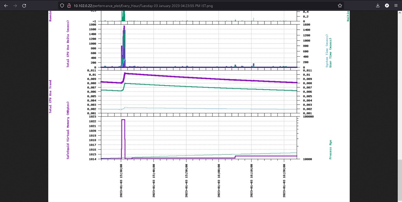
Below plot is generate is of 1 hour.
To Be Used When You Want to :
Pin point the time range anomaly occurred.
Virtual memory and process age.
Purple line indicates SafeSquid’s virtual memory usage in (Megabytes) for the last 1 hour.
Green line indicates SafeSquid process age. You will notice spikes in process age if the SafeSquid service has been restarted.
To Be Used When You Want to :
Check SafeSquid’s virtual memory used and SafeSquid process age over a period of time.
Check the process age and identify when the proxy service has been restarted.
Total CPU Use Trend.
Shows total CPU usage trend for selected duration.
Purple line indicates total CPU use trend, helps identify total CPU consumption
This plot can be used to refer the overall pattern of a CPU's usage over time.
This can be represented in a plot show the usage of a CPU has changed over a specific period of time, such as the last hour, day, or week.
The trend can show patterns of usage such as consistently high usage during certain times of day, or spikes in usage at specific moments.
To Be Used When You Want to :
Analyze the CPU usage trend, you can gain insight into how your system is being used and identify potential performance issues or bottlenecks.
Total CPU use Delta, System time and user time.
Purple line indicates Total CPU usage in Delta, Total CPU use Delta is a value which is derived from the difference between two points in time.
This is used to measure how much the CPU's usage has changed over a period of time.
With a higher delta value indicating a greater change in usage proving insight into how much resources consumed by applications and services on the system.
Green line indicates user time trend, user is the amount of CPU time spent in user-mode code (outside the kernel) within the process. This is only actual CPU time used in executing the process.
Blue line indicates system time trend, system is the amount of CPU time spent in the kernel within the process. This means executing CPU time spent in system calls within the kernel.
To Be Used When You Want to :
Analyze system resource usage over a period of time.
Running and waiting process.
Purple line indicates the running process, shows all the running process in your SafeSquid proxy server.
Green line indicates the waiting process, shows all process which are waiting to be executed.
To Be Used When You Want to :
Check total number of process running and the waiting number of process to be executed in your server
System Load Average.
Purple line indicates load average of last 1 minute.
Green line indicates load average of last 5 minutes.
Blue line indicates load average of last 15 min.
Using this plot you can get an estimate of system utilization over a period.
Example: suppose you are have a system of 8 cores and the load average of 1 minute is 7.0 which is considered to be average. If load average reaches 8.0 or above then the system is overwhelmed and unable to keep up with demand, which can lead to poor performance and long wait times for users.
To Be Used When You Want to : Monitor The load average for the number of processes that are in a "runnable" or "uninterruptible" state (i.e., processes that are actively using the CPU or waiting for a resource) over a given period.
DNS Query Failure, outbound connections failed and thread error.
Purple line indicates DNS failure.
Green line indicates outbound connection failure.
Blue line indicates threading error.
This plot will help you understand total DNS and outbound connection failures or thread error.
This plot is to referred when wanting to know DNS failures, connections failures overall or any threading errors.
To Be Used When You Want to : Validate if your proxy server is experiencing any DNS or outbound connection failures.
SafeSquid memory Utilization.
Purple line indicates safesquid’s virtual memory.
Green line indicates safesquids library memory.
Dark blue line indicates safesquids delta memory.
Yellow line indicates safesquids code memory.
Orange line indicates safesquids shared memory.
Sky blue line indicates safesquid’s resident memory.
Total and Free system memory
Purple line indicates total memory
Green line indicates free memory
You can refer to this plot when wanting to know total and free memory proxy server has.
To Be Used When You Want to :
Validate memory utilization over a period of time.
Total and Free system memory.
Purple line indicates total memory.
Green line indicates free memory.
You can refer to this plot when wanting to know total and free memory proxy server has.
To Be Used When You Want to :
Get total free memory over a period of time.
Spare, Waiting, Use client threads.
Purple line indicates spare client threads, which are unused and can be used to create a new connection.
Green line indicates threads which are in use
Blue line indicates client threads which are waiting for a thread to complete.
To Be Used When You Want to :
Get and estimate of total available threads and number of threads used overtime, waiting thread indicates that users connection is on hold and waiting for the thread to be complete.
Total DNS queries.
Total DNS queries made and DNS queries reused.
Purple line indicates the total DNS queries made
Green line indicates total reused DNS queries.
To Be Used When You Want to :
Check total DNS queries made and total DNS queries reused.
Caching Object.
Purple line indicates the caching object.
Green line indicates caching object removed from memory.
Blue line indicates caching object added to memory.
When caching is enabled in SafeSquid , all cache objects are show in here.
To Be Used When You Want to :
Status of your cached objects.
Total Bytes In and Out.
Purple line indicates Total bytes in.
Green line indicates total bytes out.
You can check the data bytes sent In and Out of the proxy server to analyze the bandwidth consumption.
To Be Used When You Want to :
Monitor the bandwidth consumption when you are on a limited bandwidth.
TCP connections.
Purple line indicates total TCP connections handled by SafeSquid.
Green Line indicates Idle TCP connections.
This plot will help you identify.
Total TCP connections are the connections which has established a secure connection between the web serves and the data is transmitted securely.
Idle TCP connections are those connections which has established a secure connection between the web serves but no data is transmitted.
To Be Used When You Want to :
Know number of TCP connections established and how many connections are idle.
Outbound Connections Pool.
Purple line indicates outbound connections in pool which are reused.
Green line indicates total outbound connections.
This plot will help you understand total outbound connection which are in pool and the outbound connection reused from the pool.
To Be Used When You Want to :
Check the number of outbound connections that are kept in pool, out of which how many are reused.
Client transaction handled and outbound connection demanded.
Purple line indicates all client transactions handled.
Green line indicates all outbound connections demanded.
Total client transaction handled by SafeSquid can be used to understand number of transactions handled by SafeSquid and number of outbound connections demanded.
To Be Used When You Want to :
Validate the total number of connections demanded by client.
New Incoming connections and client connection in pool.
Purple line indicates all New incoming connections
Green line indicates all client’s connection in pool
To Be Used When You Want to :
Get an estimate of total number of requests made to proxy server and number of client connections are store in pool for reuse.
Concurrent Connections.
Purple line indicates all concurrent client connections.
Green line indicates all concurrent active requests.
Total number of concurrent connections made to proxy server and total number of active concurrent connections.
To Be Used When You Want to :
Know total concurrent connections handled by proxy server and active concurrent connection at the time.
Default Process of Creating Performance Plot
SafeSquid’s web interface http://safesquid.cfg has an option to generate performance plot using time frequency.
Performance plot generated from SafeSquid’s web interface is snail paced and if selected time frequency contains loads of user log data, then generation time can take forever.
This can cause delay in critical troubleshooting process.
Automating plot generation based on set time intervals is not possible from web interface, example: plots to be generate every 1 hours or every day is not possible from web interface.
Performance plots generated from SafeSquid’s CLI is a better option as the generation time is comparatively lower than plots generate via SafeSquid’s web interface.
However, for using this script you will be needing to provide argument which are start time and end time using environment variables.
Getting required start time and end time can sometimes be challenging as the timestamp used in performance log is not easy to understand.
Creating Performance Plot using genPlot.sh Script
Using genPlot.sh, creation of performance plots is automated and based on set time intervals genPlot.sh generates performance plots and stores in appropriate folder.
Monit helps to automated the process of generating performance plot on custom frequency.
Note: Generation of performance plot for past 1 hour takes about 7-8 minutes using genPlot.sh script Example: You can generate performance plot every 1 hour, day, week, fortnight, month, year
You can also use genPlot.sh as a standalone script to generate reports as required.
Automating the Process of Performance Plot Creation
To automate the process of plot creation on custom time follow below steps:
Installation
Download the genPlot.tar.gz file
wget https://<Download Location> -O /tmp/ ; tar -xzvf /tmp/genPlot.tar.gz -C /usr/local/src/
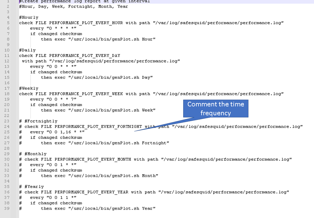
Edit plot.monit file and comment the time frequency which will not be used to generate plot
After updating copy plot.monit file to /etc/monit/conf.d/
cp /usr/local/src/plot.monit /etc/monit/conf.d/
Copy genPlot.sh script to /usr/local/bin/
cp /usr/local/src/genPlot.sh /usr/local/bin/
Add execute permissions
chmod 755 /usr/local/bin/genPlot.sh
Check the Monit control file and reload Monit
monit -t && monit reload
Performance plot will be generated every hour, day and week as per our plot.monit file.
Validating
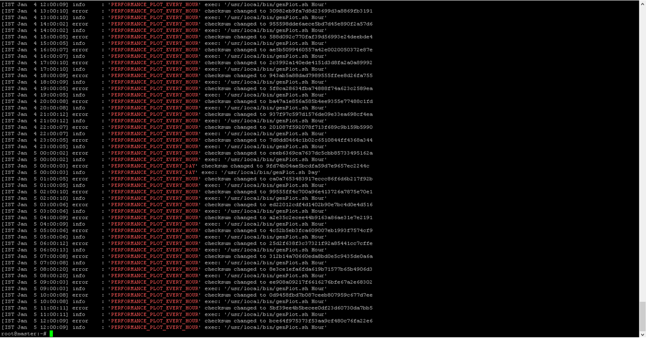
To view the logs for plot creation check your /var/log/monit.log file
Note: Do not check for logs immediately after setting up the scripts, wait for at least couple of hours and then check for logs
grep -E "PERFORMANCE_PLOT_EVERY_(HOUR|DAY|WEEK)" /var/log/monit.log
How to view generated plots
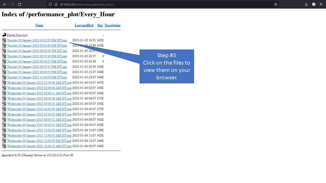
Using a Web-Server
To view generate plot in your browser install Apache web server.
To install Apache web server run below command
apt install apache2
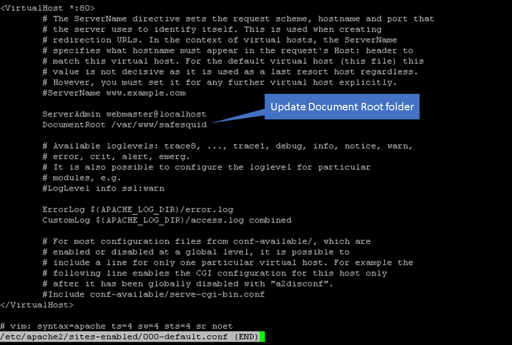
edit the /etc/apache2/sites-enabled/000-default.conf
vim /etc/apache2/sites-enabled/000-default.conf
Update the document root from /var/www/html to /var/www/safesquid
Now reload the site configurations using below command
a2dissite 000-default.conf && systemctl reload apache2 && a2ensite 000-default.conf && systemctl reload apache2
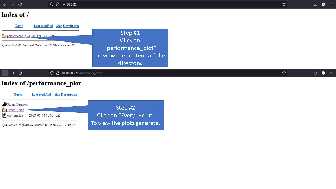
Now open your browser access the webserver using servers IP address
On a local Machine
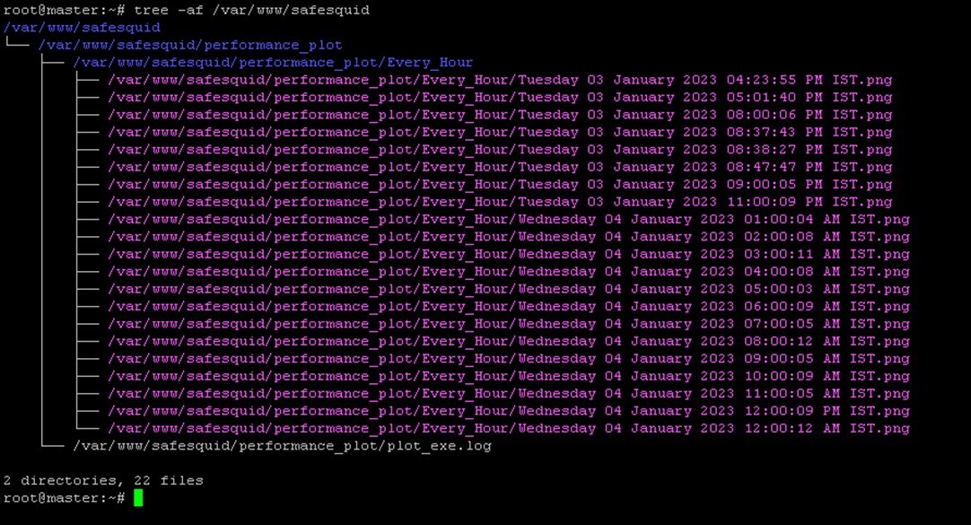
For users without a webserver, you can access the generated performance plot from /var/www/safesquid/performance_plot location.
To view all plots created run below command.
tree -af /var/www/safesquid
Based on the frequency set you can access the folder and view your performance log.
For example: users who have set Monit to configure plot every hour will find the performance plot to be located inside folder Every_Hour
Copy the files to your location machine and using any image view you can view your performance plots.
Generate plot as required
Usage
To generate report as required run command
 genPlot.sh <options>
 Options: Hour, Day, Week, Fortnight, Month, Year
 Example: genPlot.sh Hour
Example command will generate performance plot of last 1 hour


