Difference between revisions of "Generating Performance Plot & Automating the Process"
| (146 intermediate revisions by the same user not shown) | |||
| Line 1: | Line 1: | ||
= | = Overview = | ||
SafeSquid is a powerful networking tool that operates at the application layer of the OSI model. | |||
As it inspects and filters every connection made by users, it requires adequate computing resources to ensure a smooth user experience. | |||
The amount of resources required will depend on the number of users and their usage patterns. | |||
However, as user traffic increases, so does the CPU and memory consumption of SafeSquid, potentially affecting the browsing sessions of end-users. | |||
To prevent this, it is crucial to ensure that the deployed SafeSquid instance has enough computing power to handle all user requests without any bottlenecks. | |||
To aid in this process, SafeSquid offers a performance plot generation feature, which helps to identify the connections handled by SafeSquid and the corresponding CPU and memory consumption. | |||
The performance plot illustrates key performance indicators such as response time, throughput, concurrent connections and error rate on the y-axis and the progression of time on the x-axis. | |||
These performance plots provide valuable insights into the proxy server's performance, allowing for the identification of trends, patterns, and potential bottlenecks. | |||
By analyzing the performance plot, administrators can make informed decisions and take necessary actions to optimize the proxy server's performance, ensuring smooth and efficient operations for all users. | |||
= | The performance plot is a powerful tool that allows administrators to proactively monitor and manage the performance of their SafeSquid instance. | ||
= Performance Plot Explained = | |||
== Time Range. == | |||
By examining the plot in detail by using custom time range, you can pinpoint the precise time range in which an anomaly occurred, enabling a more refined and focused investigation into the underlying cause. | |||
Additionally, by focusing on a shorter time window, it can be easier to identify patterns or trends that may have gone unnoticed when examining broader, longer-term data sets. | |||
This can ultimately lead to a deeper understanding of the system's behavior and potentially inform actions to optimize performance. | |||
[[File:Slide1-plots1.jpg|left]] | |||
== Virtual memory and process age. == | |||
The purple line in the graph represents SafeSquid's virtual memory usage in Megabytes over the last hour. | |||
The green line represents the age of the SafeSquid process. | |||
Spikes in the green line indicate when the SafeSquid service has been restarted. | |||
This graph can be used to monitor SafeSquid's virtual memory usage and process age over time, as well as identify instances of the proxy service being restarted. | |||
[[File:Slide2-plots.png|left]] | |||
== Total CPU Use Trend. == | |||
This graph displays the total CPU usage trend over a selected duration. | |||
The purple line represents the total CPU usage, which helps to identify overall CPU consumption. | |||
This plot can be used to understand the pattern of CPU usage over a specific period of time, such as the last hour, day, or week. | |||
It can reveal patterns such as consistently high usage during certain times of day or spikes in usage at specific moments. | |||
This graph can be used to analyze CPU usage trends, which can provide insight into how the system is being used and identify potential performance issues or bottlenecks. | |||
[[File:Slide3-plots.png|right]] | |||
== Total CPU use Delta, System time and user time. == | |||
The purple line in the graph represents the Total CPU usage in Delta. | |||
The Total CPU usage Delta is a value that is calculated as the difference between two points in time. | |||
This measurement is used to determine how much the CPU's usage has changed over a period of time. | |||
A higher delta value indicates a greater change in usage and provides insight into the amount of resources consumed by applications and services on the system. | |||
The green line represents the user time trend, which is the amount of CPU time spent in user-mode code (outside the kernel) within the process. | |||
This is only actual CPU time used in executing the process. | |||
The blue line represents the system time trend, which is the amount of CPU time spent in the kernel within the process. | |||
This includes executing CPU time spent in system calls within the kernel. | |||
This graph can be used to analyze system resource usage over a period of time. | |||
[[File:Slide4-plots.png|left]] | |||
== Running and waiting process. == | |||
The purple line in the graph represents the running process. | |||
It shows all the processes that are currently running on your SafeSquid proxy server. | |||
The green line represents the waiting process. | |||
It shows all the processes that are waiting to be executed. | |||
This graph can be used to check the total number of processes running and the number of processes waiting to be executed on your server. | |||
This can be helpful in identifying potential issues with process management and system resource usage. | |||
[[File:Slide5-plots.png|right]] | |||
== System Load Average. == | |||
This graph displays the load average for a given period of time. | |||
The purple line represents the load average for the last 1 minute, the green line represents the load average for the last 5 minutes, and the blue line represents the load average for the last 15 minutes. | |||
This plot can be used to estimate the system utilization over a period of time. | |||
For example, if you have a system with 8 CPU cores, a load average of 1 minute of 8.0 or higher would suggest that the system is overwhelmed and unable to keep up with demand. | |||
This can lead to poor performance and long wait times for users. | |||
On the other hand, if the load average for the last 1 minute is 2.0, the last 5 minutes is 3.5 and the last 15 minutes is 4.0, it would suggest that the system is being utilized but not overwhelmed, and it may be able to handle more workloads before reaching capacity. | |||
[[File:Slide6-plots.png|left]] | |||
==DNS Query Failure, outbound connections failed and thread error. == | |||
The purple line in the graph represents DNS failure. | |||
The green line represents outbound connection failure. | |||
The blue line represents threading errors. | |||
This plot will help you understand the total DNS failures, outbound connection failures, and threading errors. | |||
This plot can be referred to when wanting to know the number of DNS failures, connection failures, and threading errors. | |||
This graph can be used to validate if your proxy server is experiencing any DNS or outbound connection failures, which can help you troubleshoot and identify any issues that may be affecting the performance of your server. | |||
[[File:Slide7-plots.png|left]] | |||
== SafeSquid memory Utilization. == | |||
This graph displays the various types of memory usage of SafeSquid proxy server. | |||
The purple line represents SafeSquid's virtual memory usage, the green line represents SafeSquid's library memory usage, the dark blue line represents the delta of memory usage, the yellow line represents the code memory usage, the orange line represents the shared memory usage, and the sky blue line represents the resident memory usage. | |||
This graph can be used to monitor the different types of memory usage of SafeSquid proxy server, which can help identify any potential memory issues or bottlenecks that may be affecting the performance of the server. This can be useful for troubleshooting and optimization of the server. | |||
[[File:Slide8-plots.png|left]] | |||
== Total and Free system memory. == | |||
The purple line in the graph represents the total memory of your proxy server. | |||
The green line represents the free memory of your proxy server. | |||
This plot can be used to monitor the total and free memory of your server over a period of time. | |||
By comparing the total memory to the free memory, you can determine how much memory is being used and how much is available. | |||
This information can be useful for troubleshooting and optimization of the server's memory usage. | |||
This graph can be referred to when wanting to know the total and free memory the proxy server has. | |||
[[File:Slide9-plots.png|left]] | |||
== Spare, Waiting, Use client threads. == | |||
The purple line in the graph represents spare client threads, which are unused and can be used to create a new connection. | |||
The green line represents threads which are currently in use. | |||
The blue line represents client threads which are waiting for a thread to complete. | |||
This plot can be used to monitor the total number of available threads, the number of threads in use, and the number of threads that are waiting over a period of time. | |||
The blue line representing the waiting thread indicates that users' connection is on hold and waiting for the thread to be completed, this can help you understand the users' experience while using the service. | |||
It can help you understand the overall thread usage of your server and identify any potential issues or bottlenecks that may be affecting the performance of your server. | |||
[[File:Slide10-plots.png|left]] | |||
== Total DNS queries. == | |||
The purple line in the graph represents the total DNS queries made, the green line represents the total reused DNS queries. | |||
This plot can be used to monitor the total DNS queries made and total DNS queries reused over a period of time. | |||
By comparing the total number of DNS queries made to the total number of reused DNS queries, you can determine the efficiency of the DNS caching system. | |||
This information can be useful for troubleshooting and optimizing the performance of the server's DNS resolution. | |||
This graph can be referred to when wanting to check the total DNS queries made and total DNS queries reused. | |||
[[File:Slide11-plots.png|left]] | |||
== Caching Object. == | |||
The purple line in the graph represents the caching objects that are currently stored in memory. | |||
The green line represents the number of caching objects that have been removed from memory. | |||
The blue line represents the number of caching objects that have been added to memory. | |||
This plot can be used to monitor the status of your cached objects over a period of time. | |||
You can use this information to understand the effectiveness of your caching system and identify any potential issues or bottlenecks that may be affecting the performance of your proxy server. | |||
This graph can be referred to when wanting to know the status of your cached objects. | |||
[[File:Slide12-plots.png|left]] | |||
== Total Bytes In and Out. == | |||
The purple line in the graph represents the total bytes that have been received by the proxy server (bytes in). | |||
The green line represents the total bytes that have been sent by the proxy server (bytes out). | |||
This plot can be used to monitor the data bytes sent in and out of the proxy server, which can be useful for analyzing the bandwidth consumption. | |||
You can refer to this plot to understand the data flow of your server and identify any potential issues or bottlenecks that may be affecting the performance of your proxy server. | |||
This graph can be used when you want to monitor the bandwidth consumption when you are on a limited bandwidth. | |||
[[File:Slide13-plots.png|left]] | |||
== TCP connections. == | |||
The purple line in the graph represents the total TCP connections handled by SafeSquid. | |||
The green line represents the idle TCP connections. | |||
This plot can be used to monitor the total TCP connections and idle TCP connections over a period of time. | |||
Total TCP connections are the connections which have established a secure connection between the web servers and the data is transmitted securely. | |||
Idle TCP connections are those connections which have established a secure connection between the web servers but no data is being transmitted. | |||
This graph can be used to know the number of TCP connections established and how many connections are idle. | |||
This information can be useful for troubleshooting server's connections. | |||
[[File:Slide14-plots.png|left]] | |||
== Outbound Connections Pool. == | |||
The purple line in the graph represents the number of outbound connections that are kept in the pool and have been reused. | |||
The green line represents the total number of outbound connections. | |||
This plot can be used to monitor the number of outbound connections that are kept in the pool and the number of outbound connections that have been reused over a period of time. | |||
This information can be useful for understanding the efficiency of the connection pool and identifying any potential issues or bottlenecks that may be affecting the performance of your proxy server. | |||
You can refer to this plot to check the number of outbound connections that are kept in the pool, out of which how many are reused. | |||
[[File:Slide15-plots.png|left]] | |||
== Client transaction handled and outbound connection demanded. == | |||
The purple line in the graph represents the total number of client transactions handled by SafeSquid. | |||
The green line represents the total number of outbound connections demanded. | |||
This plot can be used to monitor the number of client transactions handled and the number of outbound connections demanded over a period of time. | |||
This information can be useful for understanding the overall performance of the proxy server, such as how many transactions it can handle and how many outbound connections are demanded by clients. | |||
You can refer to this plot to validate the total number of connections demanded by clients, this can help you understand the users' experience. | |||
[[File:Slide16-plots.png|left]] | |||
== New Incoming connections and client connection in pool. == | |||
The purple line in the graph represents the total number of new incoming connections to the proxy server. | |||
The green line represents the total number of client connections that are stored in the pool for reuse. | |||
This plot can be used to monitor the number of new incoming connections and the number of client connections that are stored in the pool over a period of time. | |||
This information can be useful for understanding the overall performance of the proxy server, such as how many new connections it can handle and how many client connections are stored in the pool for reuse. | |||
You can refer to this plot to get an estimate of the total number of requests made to the proxy server and the number of client connections that are stored in the pool for reuse. | |||
This can help you understand how well the server is handling the incoming requests and how efficiently it's reusing the connections. | |||
[[File:Slide17-plots.png|left]] | |||
== Concurrent Connections. == | |||
The purple line in the graph represents the total number of concurrent client connections to the proxy server. | |||
The green line represents the total number of concurrent active requests. | |||
This plot can be used to monitor the number of concurrent connections made to the proxy server and the number of concurrent active connections over a period of time. | |||
This information can be useful for understanding the overall performance of the proxy server, such as how many concurrent connections it can handle and how many active requests it is processing at a given time. | |||
You can refer to this plot to know the total concurrent connections handled by the proxy server and the active concurrent connections at the time. | |||
This can help you understand how well the server is handling the incoming requests and how efficiently it is processing them. | |||
[[File:Slide18-plots.png|left]] | |||
= Default Process of Creating Performance Plot = | |||
The SafeSquid web interface has an option to generate performance plots, but it can be slow and time-consuming, especially if there is a lot of user log data. | |||
Additionally, it is not possible to automate plot generation on set intervals, such as every hour or every day. | |||
A better option for generating performance plots is using the SafeSquid CLI, as it is faster and more efficient. | |||
However, using the CLI script requires providing start and end time as arguments, which can be difficult to retrieve as the timestamp used in performance logs is not easily understandable. | |||
= Creating Performance Plot using genPlot.sh Script = | = Creating Performance Plot using genPlot.sh Script = | ||
The genPlot.sh script allows for automation of performance plot generation based on set time intervals. | |||
The script generates the plots and stores them in the appropriate folder. | |||
Additionally, Monit can be used to further automate the process and generate plots on a custom frequency. | |||
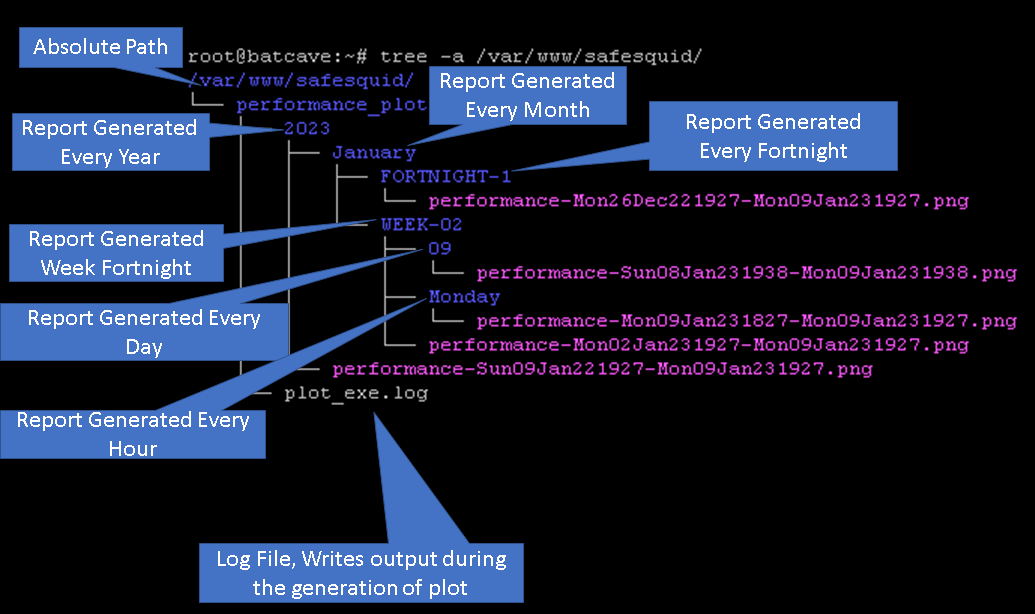
For example, you can use the script to generate performance plots every hour, day, week, fortnight, month, or year. | |||
The script typically takes 7-8 minutes to generate a performance plot for the past 1 hour. | |||
You can also use genPlot.sh as a standalone | You can also use the genPlot.sh script as a standalone tool to generate reports as needed. | ||
= Automating the Process of Performance Plot Creation = | = Automating the Process of Performance Plot Creation = | ||
To | To automate the process of plot creation on custom time follow below steps | ||
Download the | == Installation == | ||
Download the genPlot.tar.gz file | |||
wget https://<Download Location> -O /tmp/ ; tar -xzvf /tmp/genPlot.tar.gz -C /usr/local/src/ | |||
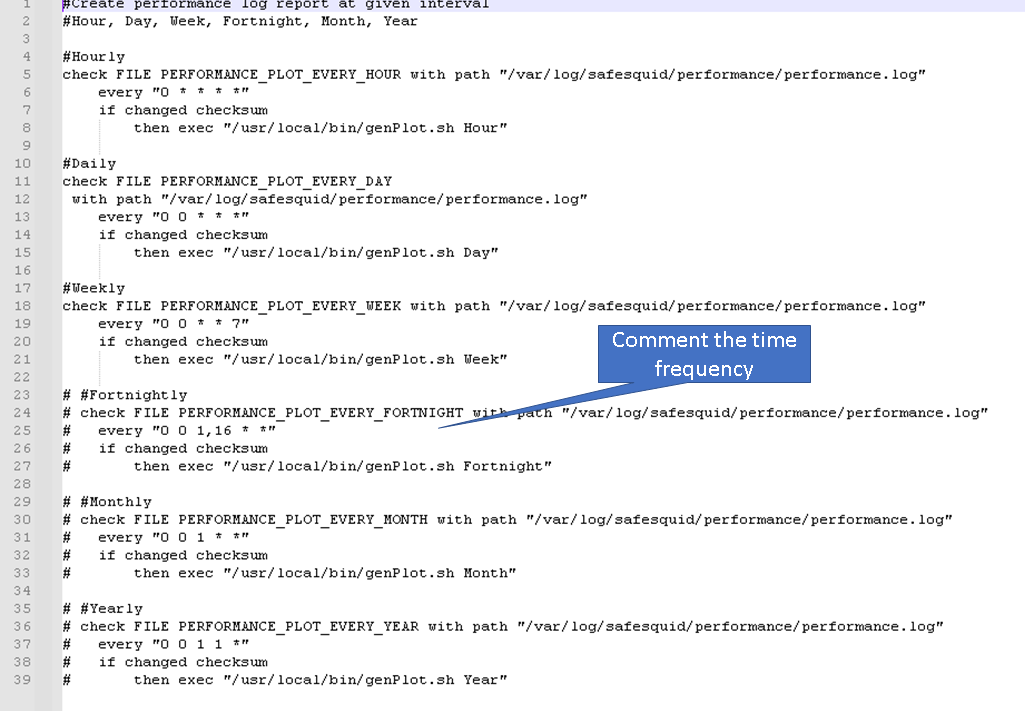
Edit plot.monit file and comment the time frequency which will not be used to generate plot | Edit plot.monit file and comment the time frequency which will not be used to generate plot | ||
[[File:Slide1-genPlotUpdate.png|left]] | [[File:Slide1-genPlotUpdate.png|left]] | ||
After updating copy | After updating Monit configuration copy plot.monit file to /etc/monit/conf.d/ | ||
cp /usr/local/src/plot.monit /etc/monit/conf.d/ | |||
Copy genPlot.sh script to /usr/local/bin/ | Copy genPlot.sh script to /usr/local/bin/ | ||
cp /usr/local/src/genPlot.sh /usr/local/bin/ | |||
Add execute permissions | |||
chmod 755 /usr/local/bin/genPlot.sh | |||
Check the Monit control file and reload Monit | Check the Monit control file and reload Monit | ||
monit -t && monit reload | |||
You can use below one line to achieve the same, execute this command after updating the plot.monit control file. | |||
cp /usr/local/src/plot.monit /etc/monit/conf.d/; cp /usr/local/src/genPlot.sh /usr/local/bin/; chmod 755 /usr/local/bin/genPlot.sh; monit -t && monit reload | |||
== Validating == | |||
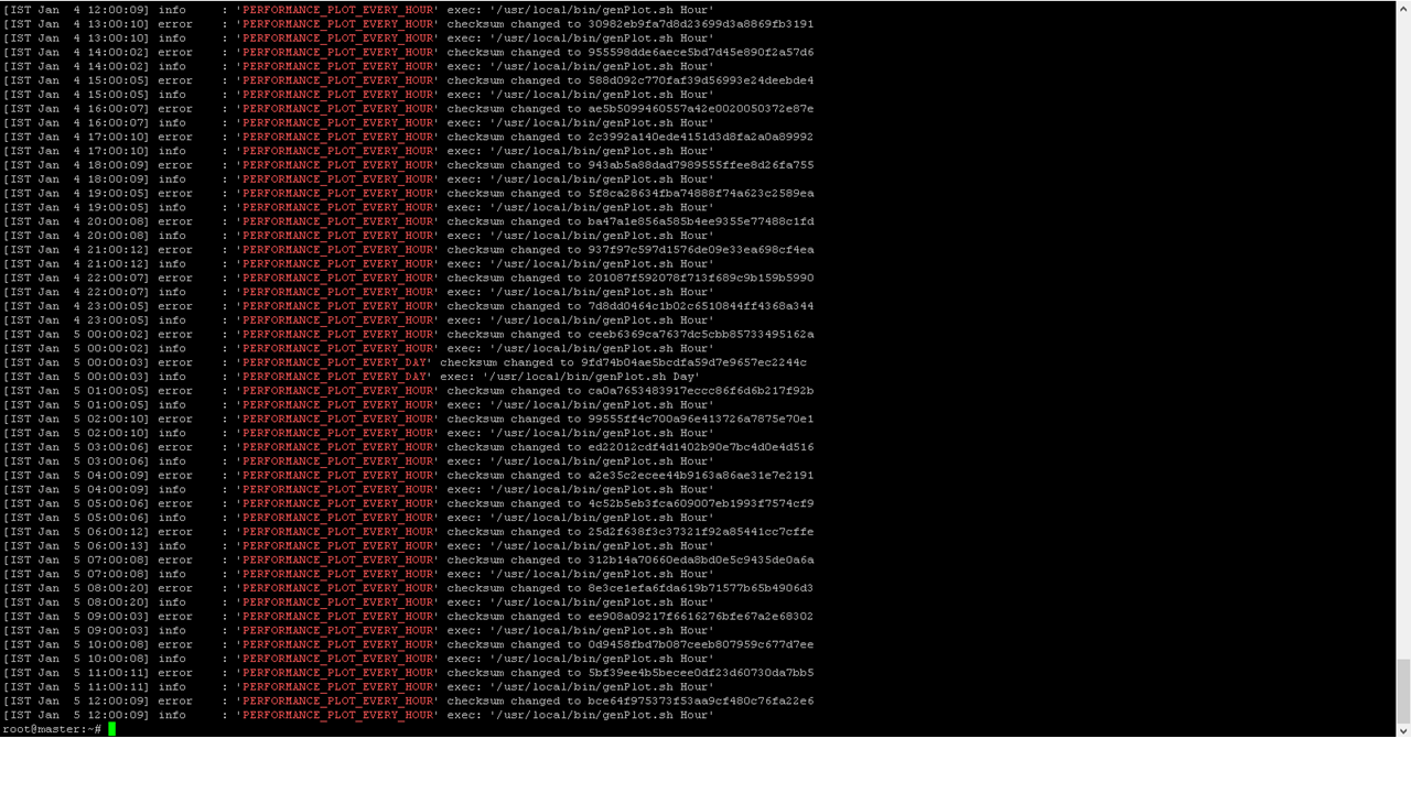
To view the logs for plot creation check your /var/log/monit.log file | |||
'''Note:''' Do not check for logs immediately after setting up the scripts, wait for at least couple of hours and then check for logs | |||
grep -E "PERFORMANCE_PLOT_EVERY_(HOUR|DAY|WEEK)" /var/log/monit.log | |||
[[File:Presentation1genplotvalidate.png|left]] | |||
= How to view generated plots= | = How to view generated plots= | ||
== | == Use a Web-Server == | ||
To view generate plot in your browser install Apache web server. | To view generate plot in your browser install Apache web server. | ||
To install Apache web server run below command | To install Apache web server run below command | ||
apt install apache2 | |||
edit the /etc/apache2/sites-enabled/000-default.conf | edit the /etc/apache2/sites-enabled/000-default.conf | ||
vim /etc/apache2/sites-enabled/000-default.conf | |||
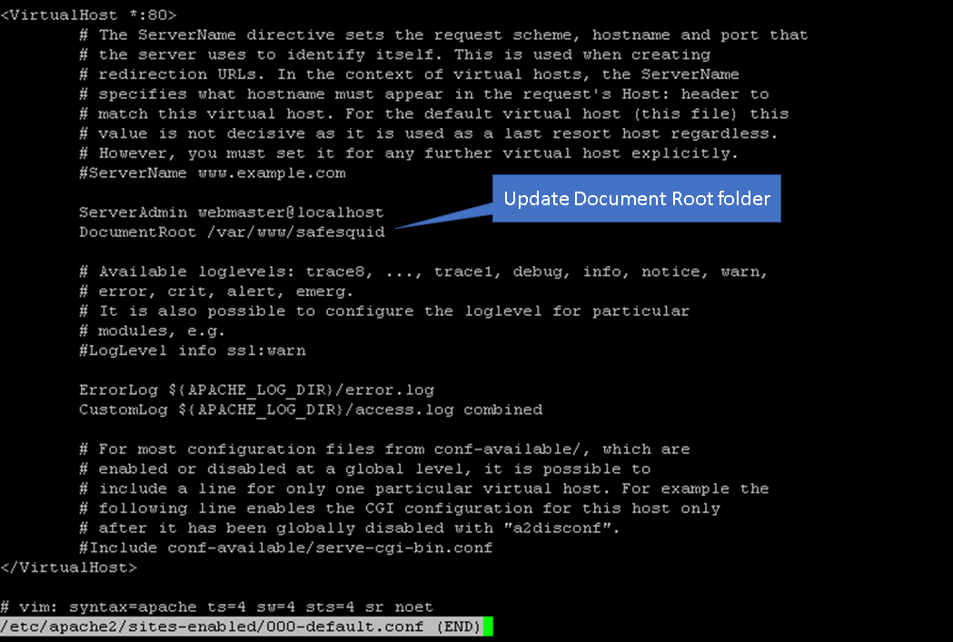
Update the document root from /var/www/html to /var/www/safesquid | Update the document root from /var/www/html to /var/www/safesquid | ||
sed -i 's/\/var\/www\/html/\/var\/www\/safesquid/' /etc/apache2/sites-enabled/000-default.conf | |||
[[File:Slide2-genPlot.png|left]] | [[File:Slide2-genPlot.png|left]] | ||
Now reload the site configurations using below command | Now reload the site configurations using below command | ||
a2dissite 000-default.conf && systemctl reload apache2 && a2ensite 000-default.conf && systemctl reload apache2 | |||
Now open your browser access the web server using servers IP address | |||
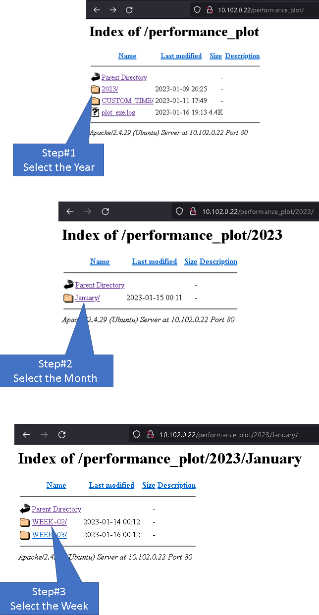
To access plots generated every hour follow below steps. | |||
[[File:Slide1-webview.png|center]] | |||
[[File:Slide1- | <br> | ||
[[File:Slide2- | [[File:Slide2-webview.png|left]] | ||
[[File:Slide3- | [[File:Slide3-webview.png|left]] | ||
[[File:Slide4-webview.png|left]] | |||
== | == local Machine == | ||
For users without a | For users without a web server, you can access the generated performance plot from /var/www/safesquid/performance_plot location. | ||
To view all plots created run below command. | To view all plots created run below command. | ||
tree - | tree -a /var/www/safesquid | ||
[[File: | [[File:Treeview-plots.png|center]] | ||
Based on the frequency set you can access the folder and view your performance log. | Based on the frequency set you can access the folder and view your performance log. | ||
For example: users who have set Monit to configure plot every hour will find the performance plot to be located inside folder | For example: users who have set Monit to configure plot every hour will find the performance plot to be located inside folder /var/www/safesquid/performance_plot/<CurrentYear>/<CurrentMonth>/<CurentWeek>/<CurrentDay> | ||
Copy the files to your location machine and open the performance plots in your browser. | |||
= Naming convention = | |||
== File Structure == | |||
[[File:Slide1-namingConvention.png|center]] | |||
<br> | |||
== File Name == | |||
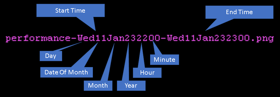
[[File:Slide2-namingConvention.png|center]] | |||
<br> | |||
= Generate plot on the go = | |||
The genPlot.sh script can be used to generate performance plots of various time ranges, including hour, day, week, fortnight, month, and year. | |||
The custom option allows users to specify a custom time range using a format similar to the --date option in the Linux date command. | |||
Usable time ranges: * minute ago, * hour ago, * day ago, * month ago, * year ago | |||
The performance plots generated using the custom option are stored in the /var/www/safesquid/CUSTOM_TIME directory. | |||
To use the script, execute the command | |||
"genPlot.sh <options>", with options being one of the listed time ranges | |||
example: genPlot.sh hour | |||
Above command will generate performance plot for last 1 hour | |||
"genPlot.sh custom <timerange>" specific time range. | |||
example: genPlot.sh custom 16 hours ago | |||
This command will generate performance plot for last 16 hours. | |||
This will generate plot for | |||
Latest revision as of 19:31, 16 January 2023
Overview
SafeSquid is a powerful networking tool that operates at the application layer of the OSI model.
As it inspects and filters every connection made by users, it requires adequate computing resources to ensure a smooth user experience.
The amount of resources required will depend on the number of users and their usage patterns.
However, as user traffic increases, so does the CPU and memory consumption of SafeSquid, potentially affecting the browsing sessions of end-users.
To prevent this, it is crucial to ensure that the deployed SafeSquid instance has enough computing power to handle all user requests without any bottlenecks.
To aid in this process, SafeSquid offers a performance plot generation feature, which helps to identify the connections handled by SafeSquid and the corresponding CPU and memory consumption.
The performance plot illustrates key performance indicators such as response time, throughput, concurrent connections and error rate on the y-axis and the progression of time on the x-axis.
These performance plots provide valuable insights into the proxy server's performance, allowing for the identification of trends, patterns, and potential bottlenecks.
By analyzing the performance plot, administrators can make informed decisions and take necessary actions to optimize the proxy server's performance, ensuring smooth and efficient operations for all users.
The performance plot is a powerful tool that allows administrators to proactively monitor and manage the performance of their SafeSquid instance.
Performance Plot Explained
Time Range.
By examining the plot in detail by using custom time range, you can pinpoint the precise time range in which an anomaly occurred, enabling a more refined and focused investigation into the underlying cause.
Additionally, by focusing on a shorter time window, it can be easier to identify patterns or trends that may have gone unnoticed when examining broader, longer-term data sets.
This can ultimately lead to a deeper understanding of the system's behavior and potentially inform actions to optimize performance.
Virtual memory and process age.
The purple line in the graph represents SafeSquid's virtual memory usage in Megabytes over the last hour.
The green line represents the age of the SafeSquid process.
Spikes in the green line indicate when the SafeSquid service has been restarted.
This graph can be used to monitor SafeSquid's virtual memory usage and process age over time, as well as identify instances of the proxy service being restarted.
Total CPU Use Trend.
This graph displays the total CPU usage trend over a selected duration.
The purple line represents the total CPU usage, which helps to identify overall CPU consumption.
This plot can be used to understand the pattern of CPU usage over a specific period of time, such as the last hour, day, or week.
It can reveal patterns such as consistently high usage during certain times of day or spikes in usage at specific moments.
This graph can be used to analyze CPU usage trends, which can provide insight into how the system is being used and identify potential performance issues or bottlenecks.
Total CPU use Delta, System time and user time.
The purple line in the graph represents the Total CPU usage in Delta.
The Total CPU usage Delta is a value that is calculated as the difference between two points in time.
This measurement is used to determine how much the CPU's usage has changed over a period of time.
A higher delta value indicates a greater change in usage and provides insight into the amount of resources consumed by applications and services on the system.
The green line represents the user time trend, which is the amount of CPU time spent in user-mode code (outside the kernel) within the process.
This is only actual CPU time used in executing the process.
The blue line represents the system time trend, which is the amount of CPU time spent in the kernel within the process.
This includes executing CPU time spent in system calls within the kernel.
This graph can be used to analyze system resource usage over a period of time.
Running and waiting process.
The purple line in the graph represents the running process.
It shows all the processes that are currently running on your SafeSquid proxy server.
The green line represents the waiting process.
It shows all the processes that are waiting to be executed.
This graph can be used to check the total number of processes running and the number of processes waiting to be executed on your server.
This can be helpful in identifying potential issues with process management and system resource usage.
System Load Average.
This graph displays the load average for a given period of time.
The purple line represents the load average for the last 1 minute, the green line represents the load average for the last 5 minutes, and the blue line represents the load average for the last 15 minutes.
This plot can be used to estimate the system utilization over a period of time.
For example, if you have a system with 8 CPU cores, a load average of 1 minute of 8.0 or higher would suggest that the system is overwhelmed and unable to keep up with demand.
This can lead to poor performance and long wait times for users.
On the other hand, if the load average for the last 1 minute is 2.0, the last 5 minutes is 3.5 and the last 15 minutes is 4.0, it would suggest that the system is being utilized but not overwhelmed, and it may be able to handle more workloads before reaching capacity.
DNS Query Failure, outbound connections failed and thread error.
The purple line in the graph represents DNS failure.
The green line represents outbound connection failure.
The blue line represents threading errors.
This plot will help you understand the total DNS failures, outbound connection failures, and threading errors.
This plot can be referred to when wanting to know the number of DNS failures, connection failures, and threading errors.
This graph can be used to validate if your proxy server is experiencing any DNS or outbound connection failures, which can help you troubleshoot and identify any issues that may be affecting the performance of your server.
SafeSquid memory Utilization.
This graph displays the various types of memory usage of SafeSquid proxy server.
The purple line represents SafeSquid's virtual memory usage, the green line represents SafeSquid's library memory usage, the dark blue line represents the delta of memory usage, the yellow line represents the code memory usage, the orange line represents the shared memory usage, and the sky blue line represents the resident memory usage.
This graph can be used to monitor the different types of memory usage of SafeSquid proxy server, which can help identify any potential memory issues or bottlenecks that may be affecting the performance of the server. This can be useful for troubleshooting and optimization of the server.
Total and Free system memory.
The purple line in the graph represents the total memory of your proxy server.
The green line represents the free memory of your proxy server.
This plot can be used to monitor the total and free memory of your server over a period of time.
By comparing the total memory to the free memory, you can determine how much memory is being used and how much is available.
This information can be useful for troubleshooting and optimization of the server's memory usage.
This graph can be referred to when wanting to know the total and free memory the proxy server has.
Spare, Waiting, Use client threads.
The purple line in the graph represents spare client threads, which are unused and can be used to create a new connection.
The green line represents threads which are currently in use.
The blue line represents client threads which are waiting for a thread to complete.
This plot can be used to monitor the total number of available threads, the number of threads in use, and the number of threads that are waiting over a period of time.
The blue line representing the waiting thread indicates that users' connection is on hold and waiting for the thread to be completed, this can help you understand the users' experience while using the service.
It can help you understand the overall thread usage of your server and identify any potential issues or bottlenecks that may be affecting the performance of your server.
Total DNS queries.
The purple line in the graph represents the total DNS queries made, the green line represents the total reused DNS queries.
This plot can be used to monitor the total DNS queries made and total DNS queries reused over a period of time.
By comparing the total number of DNS queries made to the total number of reused DNS queries, you can determine the efficiency of the DNS caching system.
This information can be useful for troubleshooting and optimizing the performance of the server's DNS resolution.
This graph can be referred to when wanting to check the total DNS queries made and total DNS queries reused.
Caching Object.
The purple line in the graph represents the caching objects that are currently stored in memory.
The green line represents the number of caching objects that have been removed from memory.
The blue line represents the number of caching objects that have been added to memory.
This plot can be used to monitor the status of your cached objects over a period of time.
You can use this information to understand the effectiveness of your caching system and identify any potential issues or bottlenecks that may be affecting the performance of your proxy server.
This graph can be referred to when wanting to know the status of your cached objects.
Total Bytes In and Out.
The purple line in the graph represents the total bytes that have been received by the proxy server (bytes in).
The green line represents the total bytes that have been sent by the proxy server (bytes out).
This plot can be used to monitor the data bytes sent in and out of the proxy server, which can be useful for analyzing the bandwidth consumption.
You can refer to this plot to understand the data flow of your server and identify any potential issues or bottlenecks that may be affecting the performance of your proxy server.
This graph can be used when you want to monitor the bandwidth consumption when you are on a limited bandwidth.
TCP connections.
The purple line in the graph represents the total TCP connections handled by SafeSquid.
The green line represents the idle TCP connections.
This plot can be used to monitor the total TCP connections and idle TCP connections over a period of time.
Total TCP connections are the connections which have established a secure connection between the web servers and the data is transmitted securely.
Idle TCP connections are those connections which have established a secure connection between the web servers but no data is being transmitted.
This graph can be used to know the number of TCP connections established and how many connections are idle.
This information can be useful for troubleshooting server's connections.
Outbound Connections Pool.
The purple line in the graph represents the number of outbound connections that are kept in the pool and have been reused.
The green line represents the total number of outbound connections.
This plot can be used to monitor the number of outbound connections that are kept in the pool and the number of outbound connections that have been reused over a period of time.
This information can be useful for understanding the efficiency of the connection pool and identifying any potential issues or bottlenecks that may be affecting the performance of your proxy server.
You can refer to this plot to check the number of outbound connections that are kept in the pool, out of which how many are reused.
Client transaction handled and outbound connection demanded.
The purple line in the graph represents the total number of client transactions handled by SafeSquid.
The green line represents the total number of outbound connections demanded.
This plot can be used to monitor the number of client transactions handled and the number of outbound connections demanded over a period of time.
This information can be useful for understanding the overall performance of the proxy server, such as how many transactions it can handle and how many outbound connections are demanded by clients.
You can refer to this plot to validate the total number of connections demanded by clients, this can help you understand the users' experience.
New Incoming connections and client connection in pool.
The purple line in the graph represents the total number of new incoming connections to the proxy server.
The green line represents the total number of client connections that are stored in the pool for reuse.
This plot can be used to monitor the number of new incoming connections and the number of client connections that are stored in the pool over a period of time.
This information can be useful for understanding the overall performance of the proxy server, such as how many new connections it can handle and how many client connections are stored in the pool for reuse.
You can refer to this plot to get an estimate of the total number of requests made to the proxy server and the number of client connections that are stored in the pool for reuse.
This can help you understand how well the server is handling the incoming requests and how efficiently it's reusing the connections.
Concurrent Connections.
The purple line in the graph represents the total number of concurrent client connections to the proxy server.
The green line represents the total number of concurrent active requests.
This plot can be used to monitor the number of concurrent connections made to the proxy server and the number of concurrent active connections over a period of time.
This information can be useful for understanding the overall performance of the proxy server, such as how many concurrent connections it can handle and how many active requests it is processing at a given time.
You can refer to this plot to know the total concurrent connections handled by the proxy server and the active concurrent connections at the time.
This can help you understand how well the server is handling the incoming requests and how efficiently it is processing them.
Default Process of Creating Performance Plot
The SafeSquid web interface has an option to generate performance plots, but it can be slow and time-consuming, especially if there is a lot of user log data.
Additionally, it is not possible to automate plot generation on set intervals, such as every hour or every day.
A better option for generating performance plots is using the SafeSquid CLI, as it is faster and more efficient.
However, using the CLI script requires providing start and end time as arguments, which can be difficult to retrieve as the timestamp used in performance logs is not easily understandable.
Creating Performance Plot using genPlot.sh Script
The genPlot.sh script allows for automation of performance plot generation based on set time intervals.
The script generates the plots and stores them in the appropriate folder.
Additionally, Monit can be used to further automate the process and generate plots on a custom frequency.
For example, you can use the script to generate performance plots every hour, day, week, fortnight, month, or year.
The script typically takes 7-8 minutes to generate a performance plot for the past 1 hour.
You can also use the genPlot.sh script as a standalone tool to generate reports as needed.
Automating the Process of Performance Plot Creation
To automate the process of plot creation on custom time follow below steps
Installation
Download the genPlot.tar.gz file
wget https://<Download Location> -O /tmp/ ; tar -xzvf /tmp/genPlot.tar.gz -C /usr/local/src/
Edit plot.monit file and comment the time frequency which will not be used to generate plot
After updating Monit configuration copy plot.monit file to /etc/monit/conf.d/
cp /usr/local/src/plot.monit /etc/monit/conf.d/
Copy genPlot.sh script to /usr/local/bin/
cp /usr/local/src/genPlot.sh /usr/local/bin/
Add execute permissions
chmod 755 /usr/local/bin/genPlot.sh
Check the Monit control file and reload Monit
monit -t && monit reload
You can use below one line to achieve the same, execute this command after updating the plot.monit control file.
cp /usr/local/src/plot.monit /etc/monit/conf.d/; cp /usr/local/src/genPlot.sh /usr/local/bin/; chmod 755 /usr/local/bin/genPlot.sh; monit -t && monit reload
Validating
To view the logs for plot creation check your /var/log/monit.log file
Note: Do not check for logs immediately after setting up the scripts, wait for at least couple of hours and then check for logs
grep -E "PERFORMANCE_PLOT_EVERY_(HOUR|DAY|WEEK)" /var/log/monit.log
How to view generated plots
Use a Web-Server
To view generate plot in your browser install Apache web server.
To install Apache web server run below command
apt install apache2
edit the /etc/apache2/sites-enabled/000-default.conf
vim /etc/apache2/sites-enabled/000-default.conf
Update the document root from /var/www/html to /var/www/safesquid
sed -i 's/\/var\/www\/html/\/var\/www\/safesquid/' /etc/apache2/sites-enabled/000-default.conf
Now reload the site configurations using below command
a2dissite 000-default.conf && systemctl reload apache2 && a2ensite 000-default.conf && systemctl reload apache2
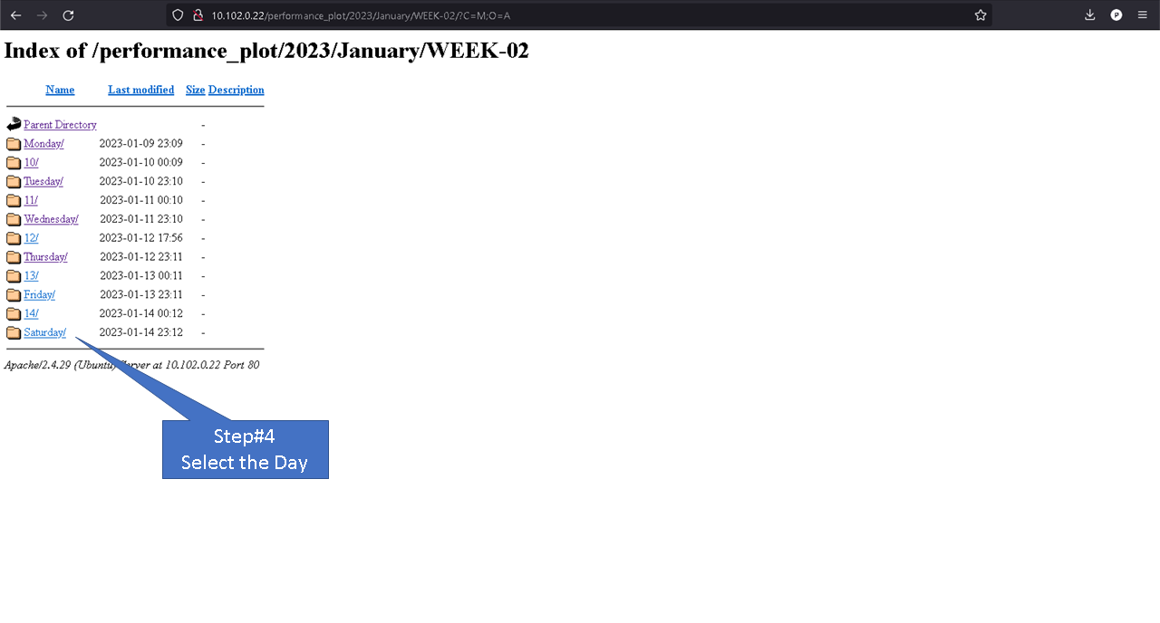
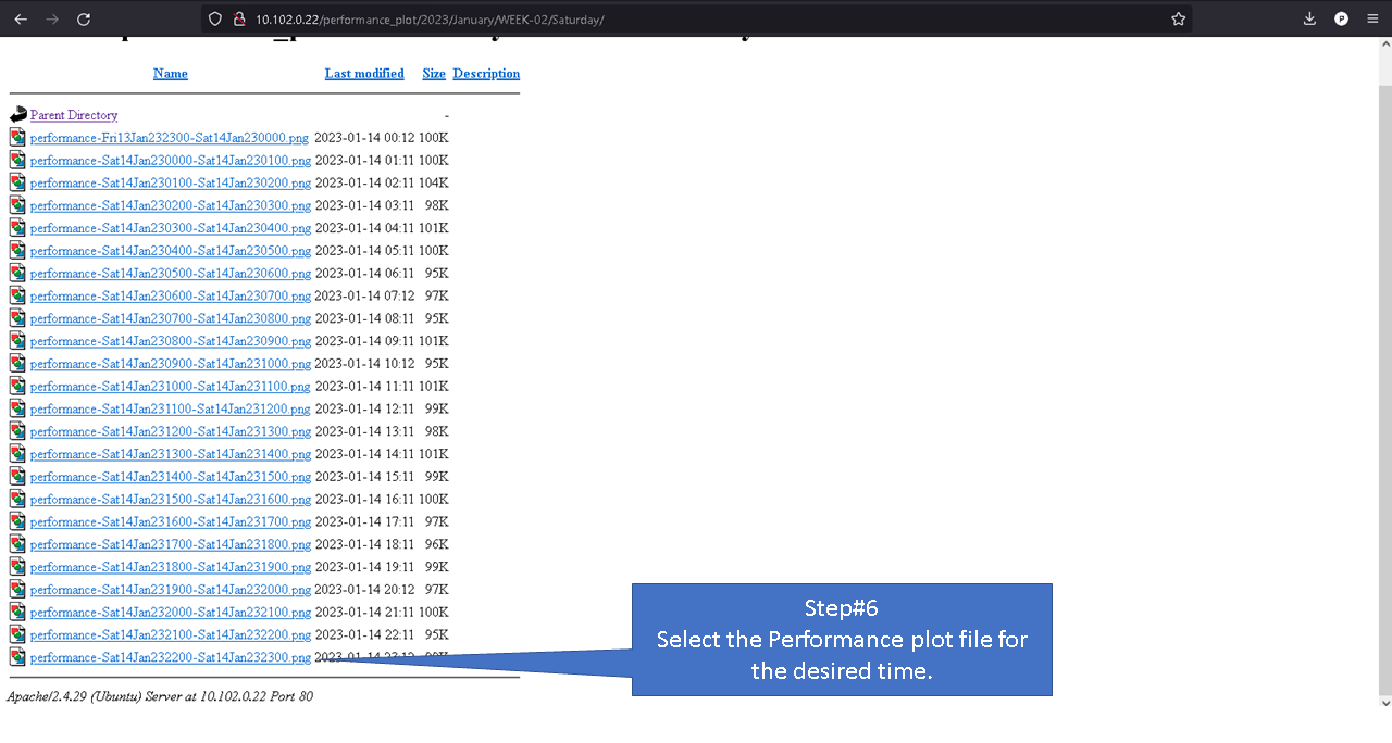
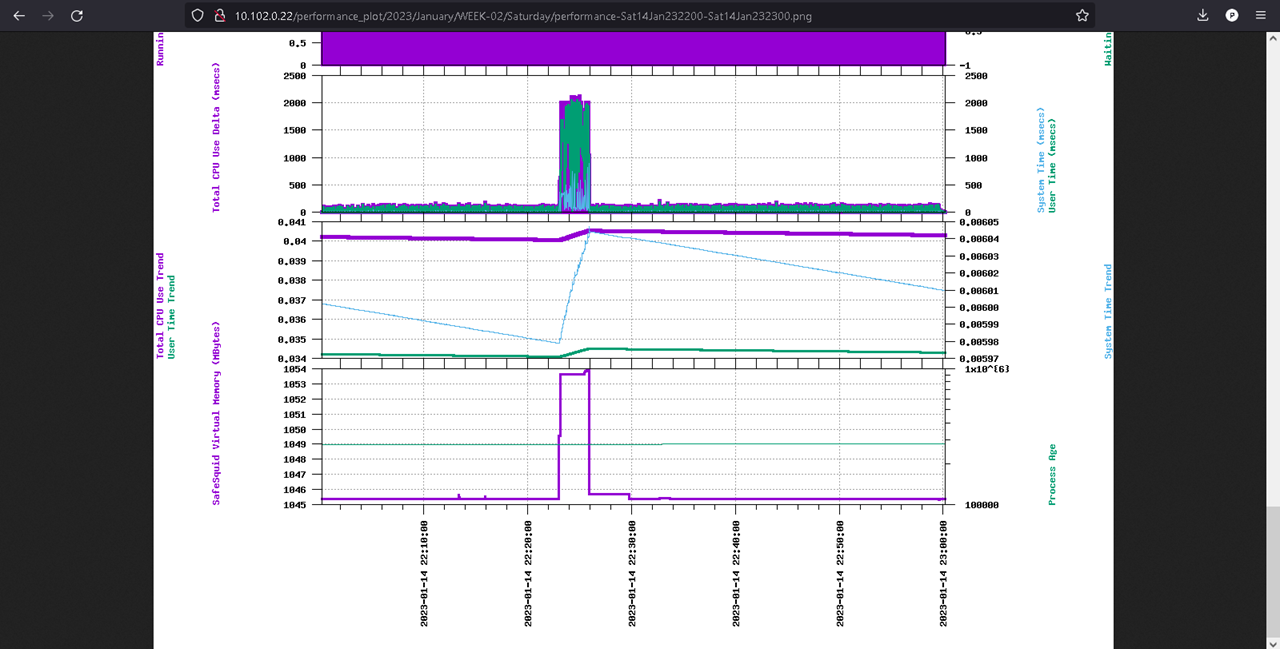
Now open your browser access the web server using servers IP address
To access plots generated every hour follow below steps.
local Machine
For users without a web server, you can access the generated performance plot from /var/www/safesquid/performance_plot location.
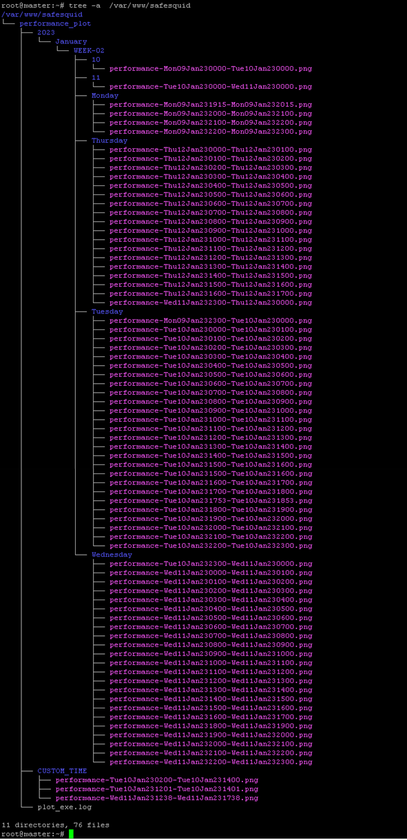
To view all plots created run below command.
tree -a /var/www/safesquid
Based on the frequency set you can access the folder and view your performance log.
For example: users who have set Monit to configure plot every hour will find the performance plot to be located inside folder /var/www/safesquid/performance_plot/<CurrentYear>/<CurrentMonth>/<CurentWeek>/<CurrentDay>
Copy the files to your location machine and open the performance plots in your browser.
Naming convention
File Structure
File Name
Generate plot on the go
The genPlot.sh script can be used to generate performance plots of various time ranges, including hour, day, week, fortnight, month, and year.
The custom option allows users to specify a custom time range using a format similar to the --date option in the Linux date command. Usable time ranges: * minute ago, * hour ago, * day ago, * month ago, * year ago
The performance plots generated using the custom option are stored in the /var/www/safesquid/CUSTOM_TIME directory.
To use the script, execute the command
"genPlot.sh <options>", with options being one of the listed time ranges
example: genPlot.sh hour
Above command will generate performance plot for last 1 hour
"genPlot.sh custom <timerange>" specific time range.
example: genPlot.sh custom 16 hours ago
This command will generate performance plot for last 16 hours.


